
Palette
Why Bright Color Needs White Space
Busy palettes feel calmer when the layout gives each color air.
AI-assisted editorial draft · human editor pending ·
Read the story ↗Stories
Six original editorial articles prepared for this draft edition.
Palette
Busy palettes feel calmer when the layout gives each color air.
AI-assisted editorial draft · human editor pending ·
Read the story ↗Texture
Highlights and reflected color can describe candy without needing labels.
AI-assisted editorial draft · human editor pending ·
Read the story ↗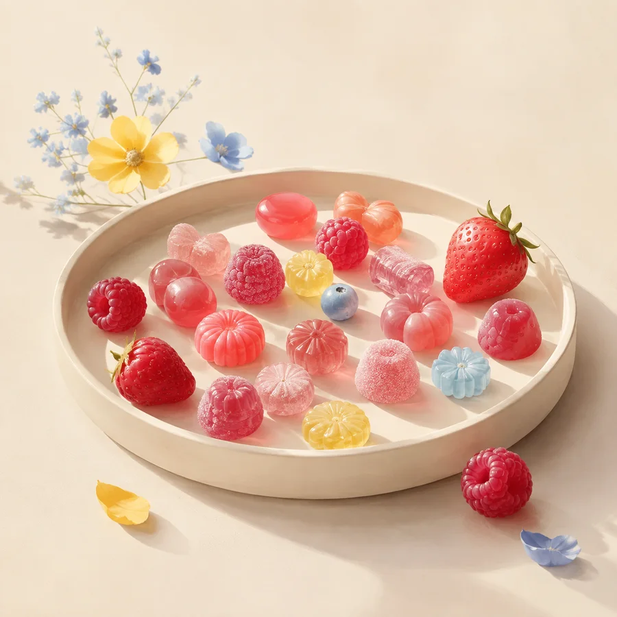
Composition
A good overhead scene uses repetition, gaps and one strong anchor.
AI-assisted editorial draft · human editor pending ·
Read the story ↗Palette
Complement-like relationships can feel lively without becoming harsh.
AI-assisted editorial draft · human editor pending ·
Read the story ↗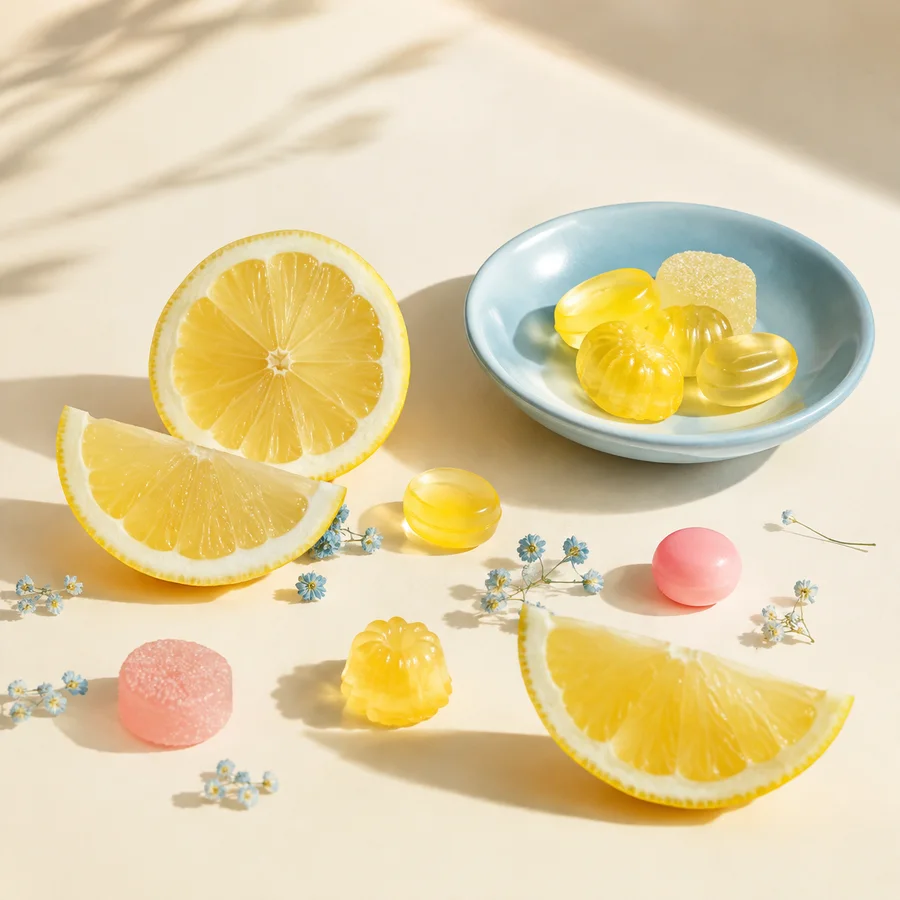
Texture
Ridges, peaks and soft shadows make a swirl feel dimensional.
AI-assisted editorial draft · human editor pending ·
Read the story ↗Composition
Editorial captions must not imply a recipe, bakery or photographed product.
AI-assisted editorial draft · human editor pending ·
Read the story ↗